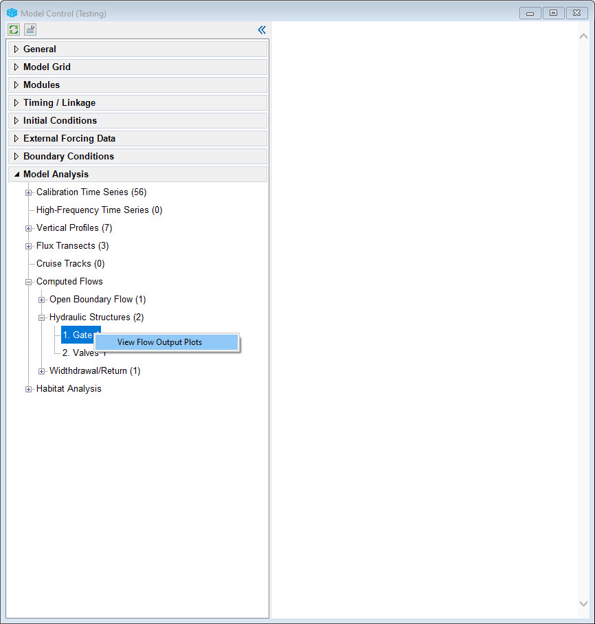
Cruise plot comparisons are useful when the user wants to compare a series of continuous sampling data with model output over some distance in the domain. In the 2DH View the or external to EE, the user should create a polygon to define a "cruise line", which corresponds to the location of data sampling transects that have been undertaken on the waterbody. EE will extract the data from this user defined line and compare it with the measured data. This tool can be accessed by RMC on Cruise Tracks sub-menu as shown in Figure 1The Computed Flows menu item provides a way to calculate discharge from EE_BC.OUT file for a boundary as hydraulic structures. After the model finished running, EE_BC.OUT file will be generated. RMC on a boundary then select view Flow Output Plots as shown in Figure 1. to calculate flow through the hydraulic structure.
| Anchor | ||||
|---|---|---|---|---|
|
Figure 1 Cruise Plot Comparisons View Flow Output Form.
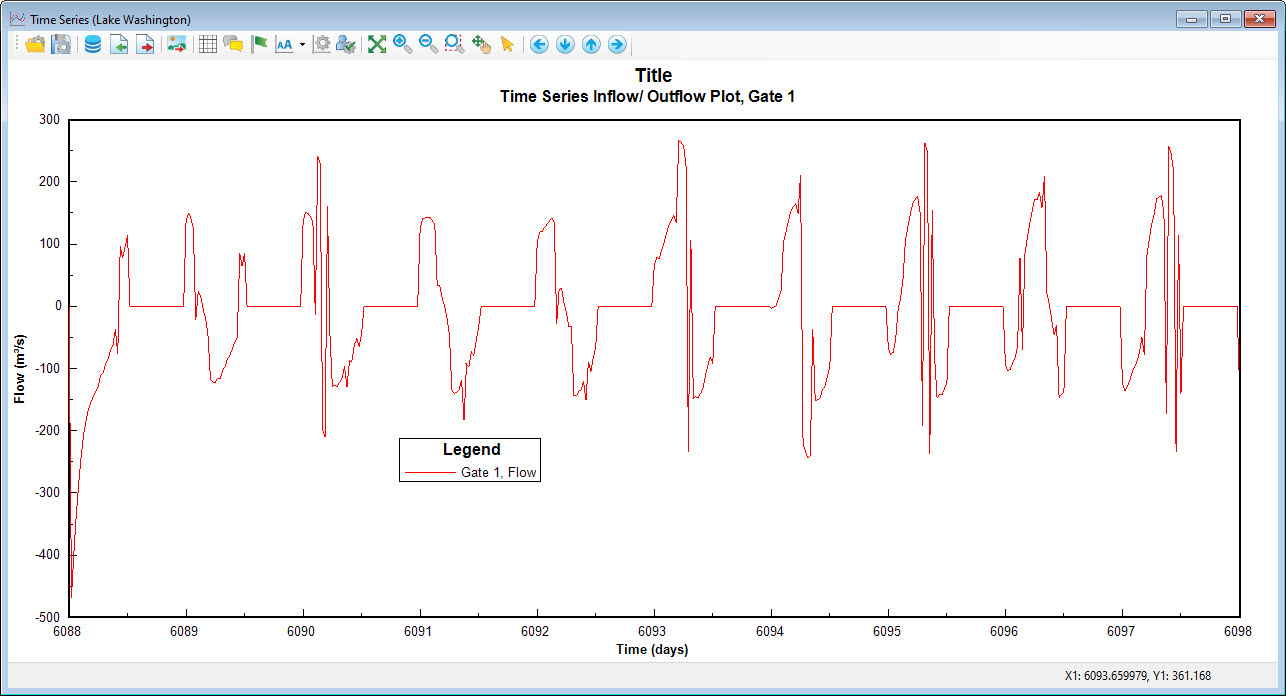
Right mouse click on the cells to obtain Station Information form to set the cruise plot data as shown in Figure 2. EE allows the use of two different kinds of cruise plot data. These are defined by station or by track. The user should define a cruise number ID for each data set. This ID will correspond to the USGS defined station IDs. If using native USGS data sets the user should select type 1 for the cruise data type. In this case the format is as shown in Figure 4. If using track data the data form should be as shown for type 2.The data path should be set for text files that are tab delimited format required for the following parameter as explained above and shown in Figure 2. All the common parameter type codes are based on the list shown in Figure 3.Figure 2 provide example plots produced by the View Flow Output Plots function. Figure 2 is for a flow through hydraulic structure
| Anchor | ||||
|---|---|---|---|---|
|
...
The colored contour represents the longitudinal and vertical distributions of salinity from the bottom to the surface of the water column. Red represents high salinity concentration, and blue represents low salinity concentration. Color patterns from left to right represent longitudinal variability, following the cruise line. Color variations from top to bottom show the vertical variability of salinity from the water surface to the bottom.
Anchor
Figure 2 Example flow time series through hydraulic structure.
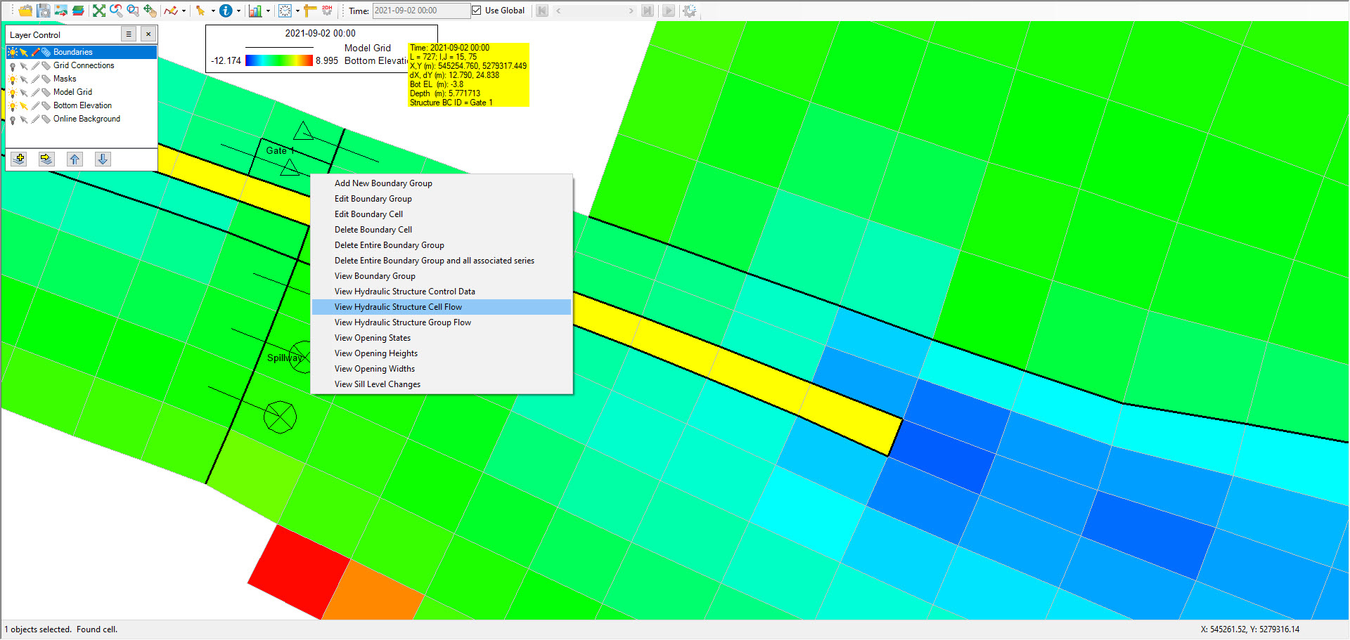
There is other way to calculate flow through hydraulic structure by RMC on that boundary then select View Hydraulic Structure Cell Flow if user want to calculate flow through that cell or select View Hydraylic Structure Group Flow if user want to calculate flow through boundary group as shown in Figure 3
| Anchor | ||||
|---|---|---|---|---|
|
Figure 3 View flow through Hydraulic Structure.


