A Taylor Diagram is a way of graphically summarizinghow closely model results match observations. The details of the diagram can be found at Taylor diagrams (Taylor, 2001). This feature is accessed from the Tools menu as described below.
Suppose that we have a time series plot that shows water depths from two models, model 1 and model 2, compared to observed data as shown in 2119172097. Now we want to evaluate which model has the better performance by using the Taylor Diagram feature from EE.
...
Figure 1. Data vs. Modeled water depth time series plot.
To use this option, click the Tools menu then select Taylor Diagram as shown in 2119172097, then the Taylor Statistics form will be displayed as shown in 2119172097. From this form select Data from the drop-down list for Base Series, then click the Calculate button to update the statistics table. Finally, click the OK button to display the plot shown in 2119172097. This diagram uses three red points to represent the two models and the observed data. From this, we can see that the red point representing the simulated results of Model 2 is closer to the observed data than Model 1. Therefore Model 2 demonstrates better performance.
...
Figure 2. Taylor Diagram option.
...
Figure 3. Taylor Statistics form.
...
Figure 4. Taylor Diagram.
Export the Taylor statistics to a file (*.taylor) by clicking on the Export Taylor statistics button on the top toolbar as shown in 2119172097. This file can be imported later by clicking the Import Taylor statistics as shown in 2119172097. The user should browse to the file (*.taylor) then click the Open button.
The Taylor diagram can be exported to an image file (*.png or *.jpg) using the button shown in 2119172097. Line style and fonts for elements of the Taylor diagram may also be adjusted using the button shown in 2119172097.
...
Figure 5. Export Taylor statistics.
...
Figure 6. Import Taylor statistics.
...
Figure 7. Export Taylor Diagram.
...
...
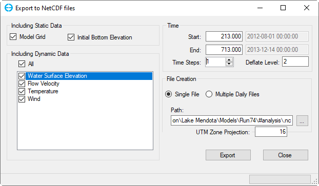
EE 10 allows the conversion of EFDC+ binary output to NetCDF-CF (NetCDF- Climate and Forecast) formatted data, which can be read and displayed on web servers.
The NetCDF files can be converted only when the model has outputs.
The user can select which parameters should be converted and the time period of the exported data as shown in Export to NetCDF files1.
In the Time frame, Julian time for Start and End is from the model as default. However, the user can define a time range to export by entering a new time for the Start and End (note that the entered time must be between the start and end time of the model).
Time Steps: This is the time step for skipping the snapshot time of the model. The default value is 1, which means that the NetCDF file contains every model's snapshot.
Deflate Level: This is the compression factor for the NetCDF file, the value ranges from 0 to 9. The higher value of the deflate level, the smaller the file size but it will take more time to export to the NetCDF file.
In the File Creation frame, the user is given the option of EFDC+ generating a Single File, or Multiple Daily Files.The Multiple Daily Files option provides one netCDF file for each one day (24 hours) of model output.
NetCDF files (.nc files) are placed in the #analysis folder along with the EFDC output.
| Anchor | ||||
|---|---|---|---|---|
|
Figure 1. Export to NetCDF file form.


