The user may select which parameters are to be displayed by accessing the Data Series form by RMC’ing on the legend or select Format Data Series from the toolbar. An example of the form is shown in Figure 1.
| Anchor | ||||
|---|---|---|---|---|
|
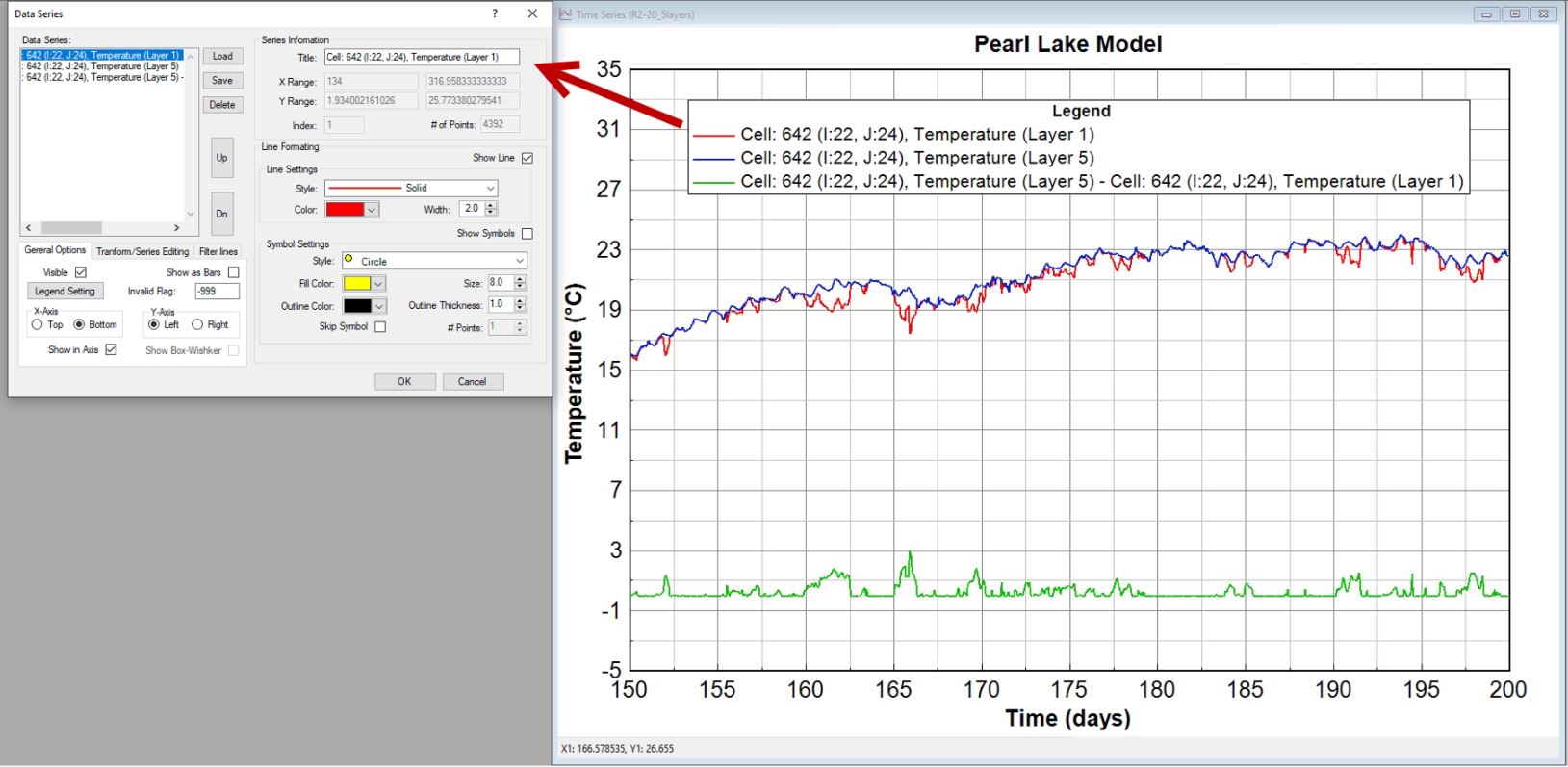
Figure 1. Data Series form.
Data Series
The lines available for viewing are displayed on the left in the Data Series box ( as shown in Figure 2).
The series formatting and axes formatting can be saved for later retrieval using the Save and Load buttons. The Delete button will delete the series selected (highlighted) in the Data Series frame (left-hand box).
The Up and Dn button is used to edit the order of data lines in the legend of the plot.
| Anchor | ||||
|---|---|---|---|---|
|
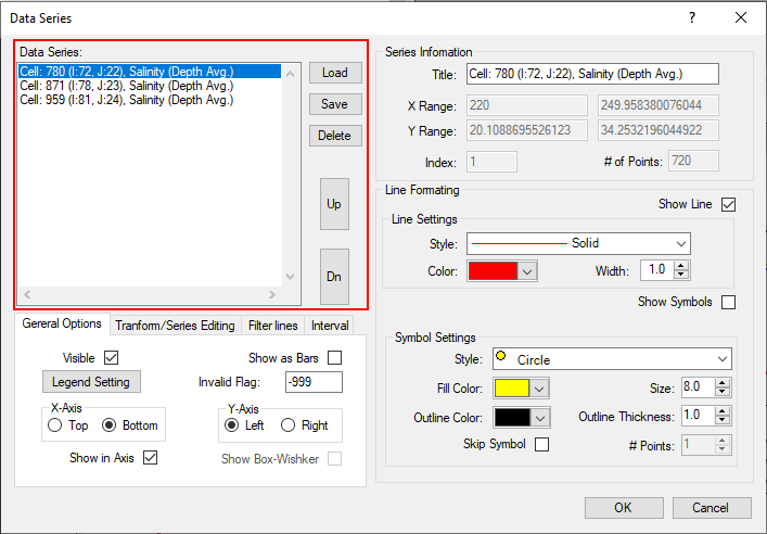
Figure 2. Data Series.
Series Information
The right side of the form is the Series Information frame ( as Figure 3) that shows the maximum and minimum values, and the number of points for the selected line. The legend text for the selected line can also be changed in this frame. In the Line Formatting frame, the user may set thickness, color, and style with the drop-down menus.
LMC on one of the series in the left-hand box will highlight that series. Holding down the control key allows the user to select multiple series. The user can then change line/point styles in the Line Formatting frame. The series formatting and axes formatting can be saved for later retrieval using the Save and Load buttons. The Delete button will delete the series selected (highlighted) in the Data Series frame (left-hand box).
| Anchor | ||||
|---|---|---|---|---|
|
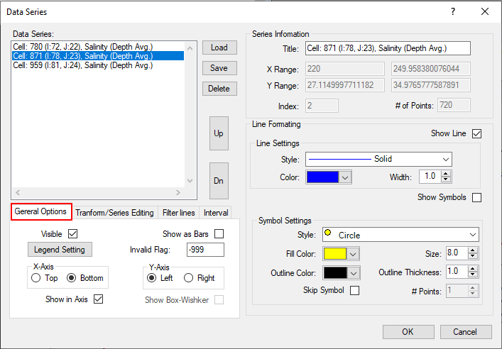
Figure 13. Data Series forminformation.
General Options
Figure 24 show the General Options frame, that the user can toggle the display of each line by checking Visible for the series selected. An extra Y-axes can be added to the right of the graph by setting the Right tab in the “Y-Axis” subframe. Other features include changing lines to bar graphs with the “Show as Bars” check box.
| Anchor | ||||
|---|---|---|---|---|
|
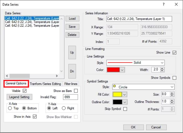
Figure 24. General Options.
Transform/Series Editing
The Transform/Series Editing tab in Figure 35 provides options for the user to adjust the data with additive and multiplicative adjustment factors for both the X and Y component for plotting purposes. The form also provides a means to add or subtract one series from another and place the resultant series into a specified series with the Add/Subtract Series button. The edited data does not update the EFDC data directly. If desired, an edited series can be exported from the time-series plot and used to update the model input data.
| Anchor | ||||
|---|---|---|---|---|
|
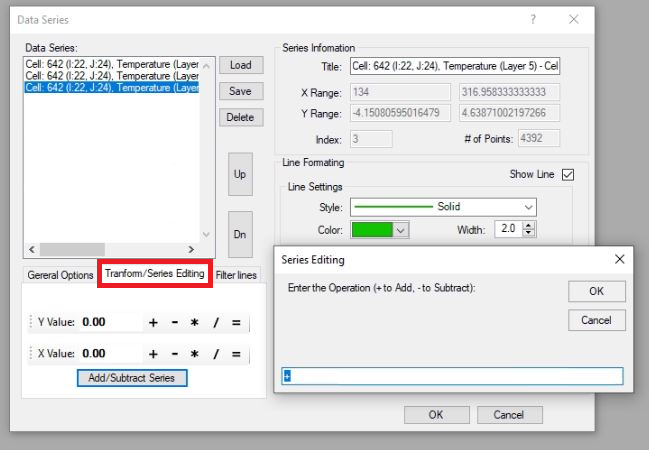
Figure 35. Transform options.
High and Low Pass Filter
...
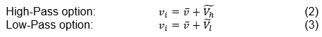
The method of high- and low-pass filtering is that the instantaneous current velocity can be represented as the sum of time-averaged value and fluctuations of high and low frequencies as follows:

where vi is instantaneous current velocity; v is time-averaged velocity; and  are fluctuations due to the high and low frequencies respectively.
Based on the Fast Fourier Transform (FFT) method for energy spectra in the frequency domain, these fluctuations are dependent on the defined cut-off frequency i.e. at 1, 3, and 5 filtering hours. After that, the inverse FFT was used to plot the high or low frequencies results.
...
In the Time Series Plotting utilitythe Filer lines, the user can choose any time series to filter as shown in in Figure 46. After After Apply Filter is selected a new time series will be plotted with its filtered series, an example of which is shown in in Figure 5.
...
7.
| Anchor | ||||
|---|---|---|---|---|
|
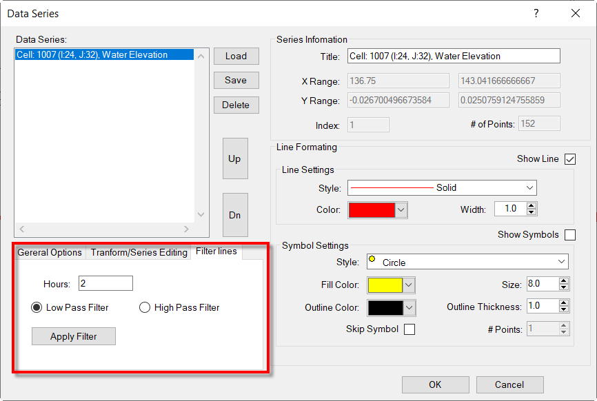
Figure 6. High and Low Pass Filter for Time Series Plotting.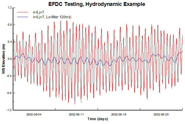
| Anchor | ||||
|---|---|---|---|---|
|

Figure 57. Time Series plot of WSEL (red) and low pass filter (blue) at location i=6, j=7.
Interval
The Interval tab in Figure 8 provides options for the user to adjust the time period between data points.
For example, Figure 9 presents the time series of the ship velocity magnitude from the model with a 1-minute interval, therefore there is a gap line when the data is missing. When the user uses the interval options, the missing data can be removed as Figure 10.
| Anchor | ||||
|---|---|---|---|---|
|
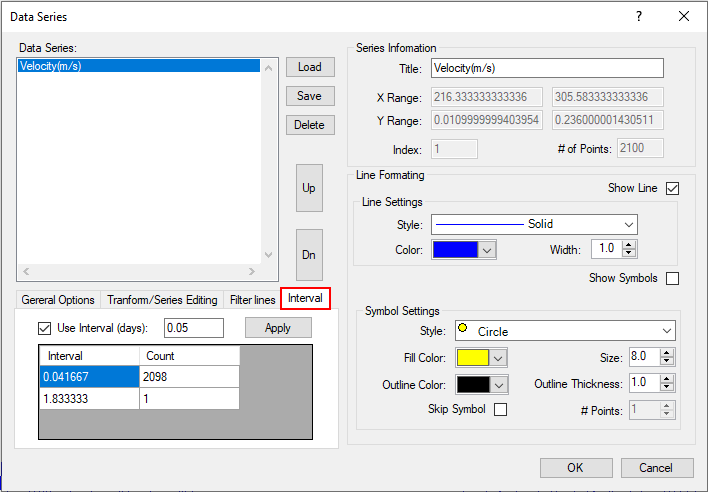 Figure 8. Interval options.
Anchor Figure 9 Figure 9
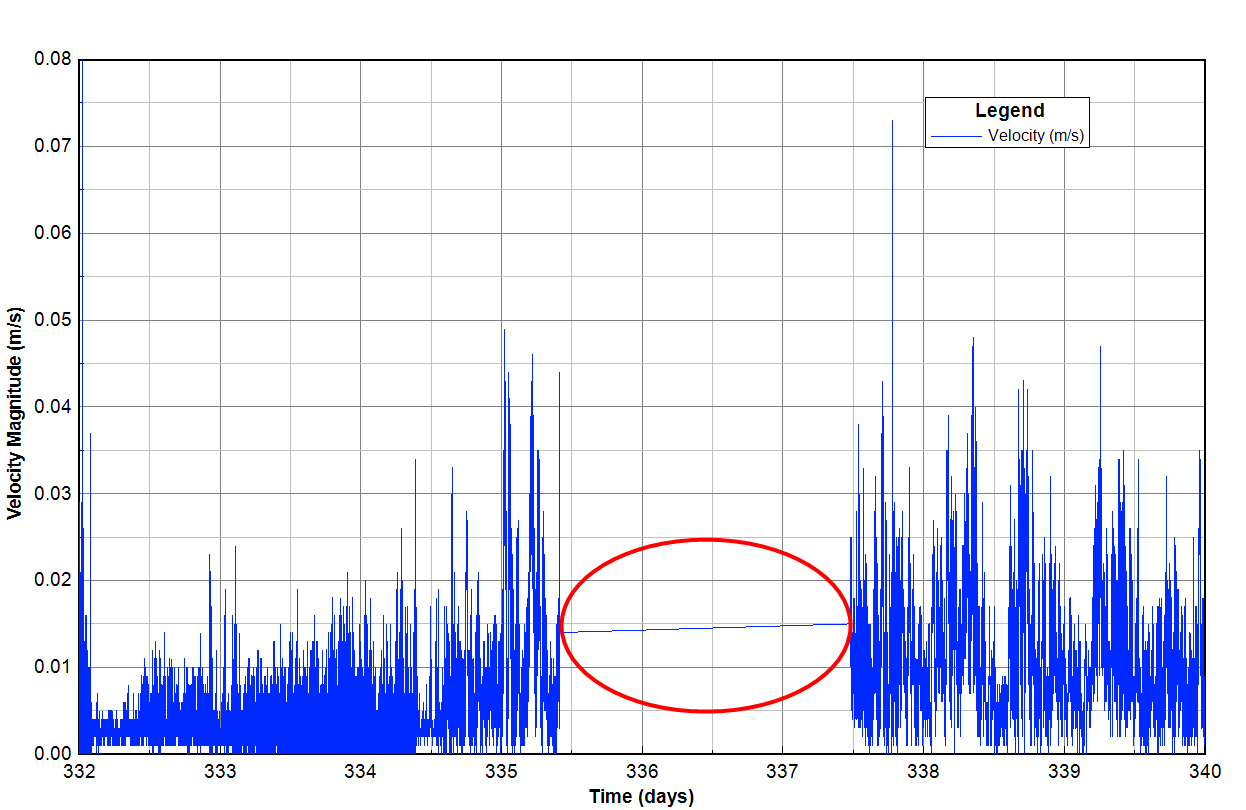
Figure 9. The time series plot before applying intervals.
Anchor Figure 10 Figure 10
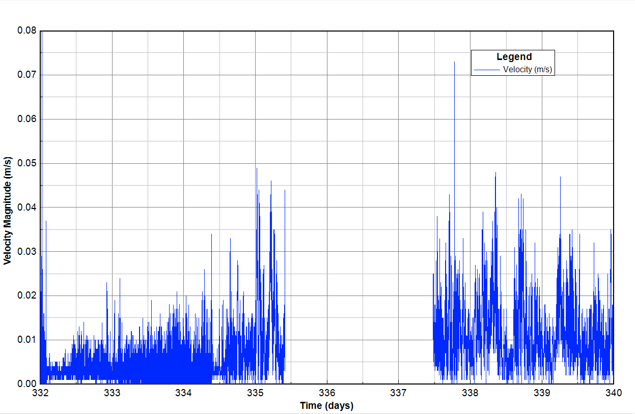
Figure 10. The time series plot after applying intervals.